We've just sent to Apple the first update for Bovine Simulator: new controls and improved performances (and a review button on the "tap to start" screen).
We have received a lot of feedback about the control system: people really like the game, the graphics, the concept... but they hate controls. We first got some hints about it on toucharcade forum, and then we started getting 2stars reviews on the AppStore. Everybody wanted something more coherent with the isometric view used in the game.
To be completely honest with you... we knew. But we decided to ignore it ù_u Bovine Simulator was born as an experimental game, so we first used the default thumbstick provided by Unreal Engine, and then we never changed it. We get used to that control system, so we could play the game just fine, but every time we gave it to friends to test it, deep inside we hoped that they didn't find it too hard to control.
Well, we learned our lesson for the future. But we're completely fine with this: we're learning a lot from this experience and, hey, it's our first game, it's OK if it's not perfect. We've also been super lucky, since every review and feedback we got was very constructive and respectful.
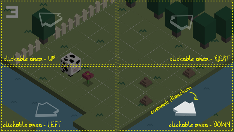
What we did was listening to people's feedback and suggestions, and came up with a solution: a four button system, with each button as large as 1/4 of the screen. This should make it easy to control Bovina without even look at the screen, but just touching one of the iPhone's corners. The directions to input would now follow exaclty Bovina's direction, as the user would expect.
We posted these prototypes on toucharcade, hoping to get feedback from "real gamers" who actually played our game, but we didn't get anybody attention. We then tested with friends and relatives, and the response was waaaay more positive than before. We had our new, improved controls :)
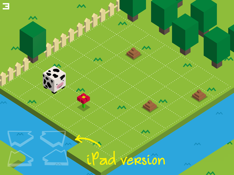
The beta-testing showed us also that people had some difficulties on the iPad, since they tryed to click exactly on the arrow (which is not necessary: the whole area is clickable, but of course they couldn't know :O), which are kind of far to reach with thumbs, when holding the iPad with both hands. That's why we built a different interface for iPad and big screens, with a d-pad in the bottom left of the screen instead of the huge four buttons.
We're very happy about this improvement, and we hope people will like it too. And, who know, maybe now that it's more usable, we will get some more attention on the game :D
Aggiungi un commento